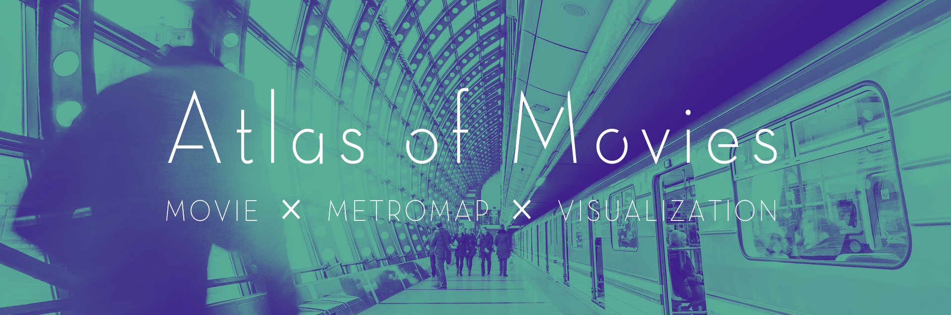
Atlas of Movies
Movie × Metro Map × Data Visualization
Category: Data Visualization
Project Type: Group
Date: September 2018
Role: Python Programming, Visual Design
Data visualization is not only a science but also a form of art.
Graph visualization always aims to present datasets in an effective
and aesthetically appealing way. Besides statistical numbers, there
are many interesting data that can be visualized as graphs. For
example, data grouped by unique one-dimensional labels can be
present as hypergraphs, and there are many fascinating way to
visualize them.
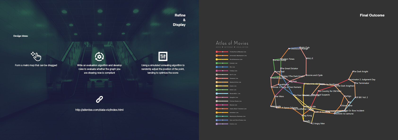
We got inspiration from city metro maps. The style of such maps are
vivid and intuitive that people can easily understand what stations
are belonged to the same metro line by looking at the unique color
of a certain line. Together, the map present a sense of order.
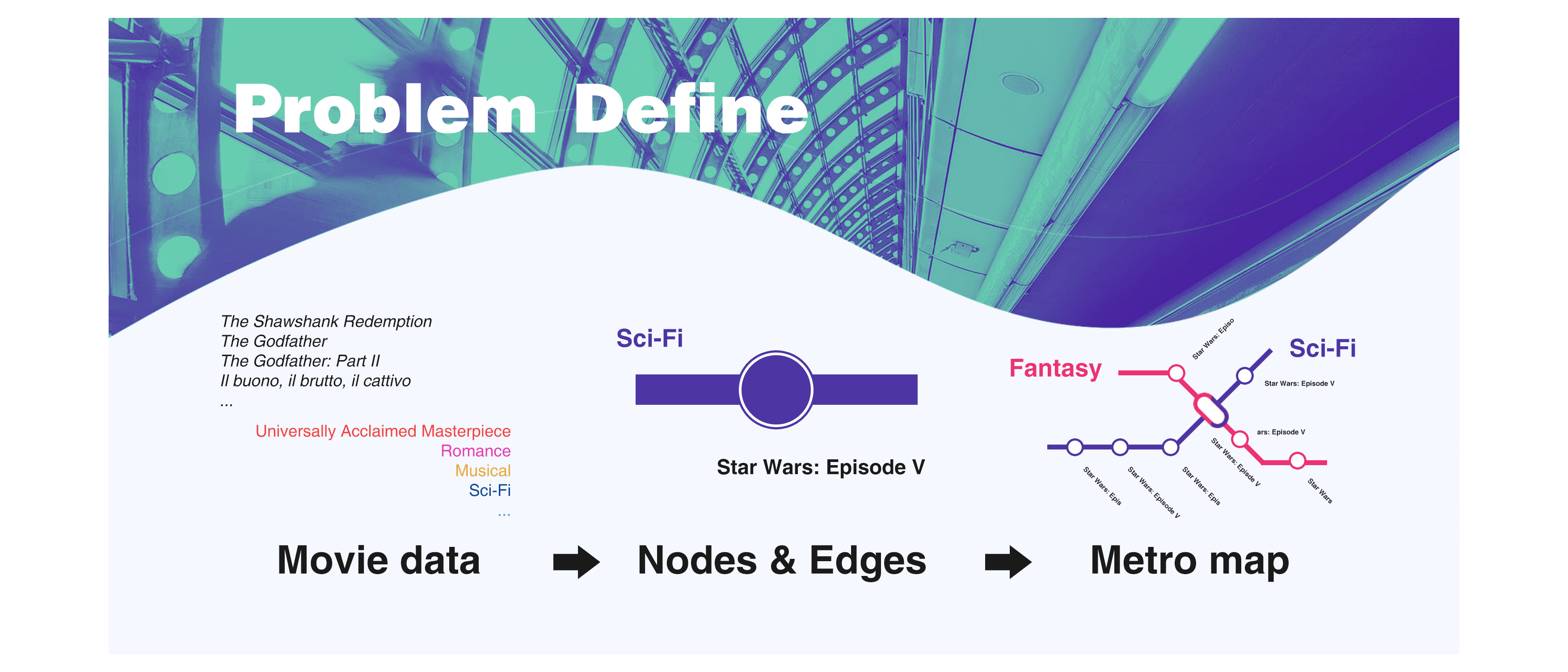
We tried to visualize a dataset into a metro map by using certain
algorithms, and we choosed the dataset of world's best movies for
the reason that movies have different genres that can be represent
as metro lines. The graph can illustrate the distribution of the
genres of world's best movies.